This is the fundamental design challenge that makes paver colour selection for multi-tenant developments a different discipline entirely from residential or single-tenant work. The hardscape is not an extension of a brand. It is the canvas on which all brands are displayed. And like any canvas, its job is to elevate the subject without competing with it.
Get the palette right, and the development looks architecturally cohesive, premium, and timeless—a property where the hardscape makes every tenancy look better. Get it wrong, and the hardscape fights with the signage, dates the property within five years, and becomes a maintenance headache that slowly degrades the development's curb appeal and lease rates.
This guide covers the colour theory, the material science, and the practical engineering behind commercial paver colour selection for multi-tenant developments in the GTA.
The Canvas of Commerce: Why Multi-Tenant Is Different
A residential homeowner selects paver colours based on personal taste, the colour of their home's brick or stone, and what they find attractive. This is subjective and entirely appropriate for a private property.
A multi-tenant commercial property owner cannot make subjective colour choices. The selection must satisfy a set of objective, measurable criteria simultaneously:
- Brand neutrality: The hardscape must not visually favour any single tenant's branding. It must function as a neutral backdrop against which a pharmacy's green crosses, a coffee chain's earth tones, a bank's cold blues, and a restaurant's warm reds all look equally at home
- Soil and traffic camouflage: A commercial development sees thousands of vehicle movements per day, foot traffic from hundreds of pedestrians, deliveries, refuse collection, and seasonal salt and sand. The paver surface will accumulate tire marks, oil drips, chewing gum, road salt residue, and general wear. The colour palette must hide this wear rather than highlight it
- Wayfinding function: Colour differentiation is one of the most effective tools for separating vehicle zones from pedestrian zones, marking accessible pathways, identifying fire routes, and directing traffic flow. The colour palette must provide enough contrast for these functional zones to be visually obvious without turning the property into a patchwork
- Longevity: Multi-tenant hardscapes are not renovated every 5 years. A well-built commercial installation serves for 20-30 years. The colour palette must age gracefully—looking dignified at year 15, not dated. What is trendy in 2026 may look embarrassing in 2036
- Cost efficiency: Commercial installations cover thousands of square metres. Exotic or custom-blend colours that add $5/m² over standard palette options multiply into significant budget impact at commercial scale. The palette must achieve the aesthetic goals using standard production colours readily available from multiple manufacturers, ensuring competitive pricing, consistent supply, and easy replacement capability for future repairs
The Luxury Minimalist Palette: Three Colours, One Language
After designing and installing commercial hardscapes across the GTA for years, we have arrived at a core palette that satisfies every criterion above. It is not complicated. It is not trendy. It is a three-colour architectural language that works on every multi-tenant property we have ever applied it to:
1. Deep Charcoal (Primary Field Colour)
Coverage: 60-70% of total paved area.
Deep Charcoal is the workhorse of the commercial palette. It is the dominant field colour for driving lanes, parking stalls, loading zones, and general-circulation areas. Why Charcoal dominates:
- Tire marks are invisible. Vehicle tire rubber leaves grey-black marks on paver surfaces. On a Charcoal paver, these marks are tonally identical to the surface— they literally cannot be seen. On a light grey or beige paver, tire marks are visible within days and create a perpetually dirty appearance that no amount of power washing fully eliminates
- Oil drips disappear. Automotive fluids (motor oil, power steering fluid, transmission fluid) leave dark stains. On Charcoal pavers, these stains are absorbed into the visual field and become imperceptible within weeks. On light pavers, they remain visible indefinitely
- Salt residue blends. De-icing salt leaves a white haze on pavers after winter. On Charcoal, this haze creates a subtle tonal variation that reads as natural patina. On medium-toned pavers (grey, tan), salt residue looks like the surface is perpetually dirty. On very light pavers, salt residue is less visible but the pavers show every other form of soiling
- Brand neutrality. Deep Charcoal is architecturally neutral—it does not compete with any signage colour. Whether a tenant's brand palette is red, blue, green, gold, or monochrome, Charcoal provides a clean, sophisticated backdrop that makes the signage pop without visual conflict
- Timelessness. Charcoal has been a staple of high-end architectural design for decades. It does not date. A Charcoal hardscape installed in 2006 looks as contemporary today as it did then. The same cannot be said for the terracotta, salmon, and multi-colour blends that were popular in the early 2000s and now read as unmistakably dated
Manufacturer specification: Look for "Charcoal" or "Onyx Black" in the through-mix integral colour range (colour mixed throughout the entire paver body, not just surface-applied) from major Canadian manufacturers (Unilock, Oaks, Permacon, Techo-Bloc). Through-mix colour means that surface wear, chipping, and even minor abrasion from snowplough blades does not expose a different-coloured core—the paver looks the same at any depth.
2. Warm Off-White (Secondary Accent / Pedestrian Zone)
Coverage: 15-25% of total paved area.
Warm Off-White (not cold, bluish white—specifically in the warm ivory-to-cream range) serves as the primary contrast colour for pedestrian zones, walkways, building entrances, outdoor seating areas, and accessible pathways. Why Warm Off-White, not pure white:
- Pure white shows everything. Chewing gum, leaf stains, soil tracking, beverage spills, and general foot-traffic soiling are maximally visible on a pure white surface. Within months, a pure white walkway on a commercial property looks grimy and high-maintenance
- Warm Off-White masks mild soiling. The warm yellowish undertone absorbs mild discoloration without showing contrast. The surface reads as "clean" for far longer between maintenance cycles. Soil and organic staining blend into the warm tonal range rather than appearing as dark marks on a cold-white canvas
- Visual warmth. Cold white is clinical. Warm Off-White is inviting. In pedestrian and gathering areas (outdoor patios, seating zones, entrance plazas), the warmth of the paver surface subconsciously encourages lingering, which is commercially valuable for retail and food-service tenants
- Contrast against Charcoal. The Charcoal-to-Off-White contrast is immediate, unmistakable, and intuitive. A pedestrian walking across a Charcoal parking area sees the Off-White walkway from 20+ metres away and instinctively navigates toward it. This is wayfinding through colour, and it works without signs, painted lines, or bollards
3. Rich Walnut (Tertiary Accent / Banding)
Coverage: 5-15% of total paved area.
Rich Walnut (a deep, warm brown in the umber-to-espresso range) serves as the architectural detail colour— the accent that elevates the hardscape from "functional two-tone" to "designed." Walnut is used for:
- Border banding. A 300-600mm Walnut border band running along the edges of the Off-White pedestrian zones creates a crisp frame that defines the walkway architecturally, much like a picture frame defines a canvas. Without the border, the transition from Charcoal to Off-White is abrupt. With the Walnut band, it is composed
- Feature zones. Entrance columns, monument sign surrounds, planter bed borders, tree grate frames, and outdoor dining perimeters are delineated in Walnut to mark them as architecturally intentional— distinct from the general field, worthy of attention
- Crosswalk emphasis. Pedestrian crossings within the parking area are banded in alternating Walnut and Off-White, creating a visually prominent crossing zone that reads as both a safety feature and a design element
The Walnut accent is the element that distinguishes a designed commercial hardscape from a paved one. It is the difference between a property that communicates "someone spent money here" and a property that communicates "someone thought about this." The cost premium is modest (Walnut pavers typically cost the same per m² as Charcoal or Off-White in production lines), but the visual return is disproportionate.
"Three colours. Sixty percent Charcoal, twenty percent Off-White, ten percent Walnut. That ratio has never produced a commercial hardscape we are not proud of."
What to Avoid: The Multi-Tenant Colour Mistakes
The wrong palette does not just look bad—it actively works against the property's commercial performance. The most common mistakes we see on multi-tenant developments across the GTA:
Multi-colour blends. Pavers manufactured with 3-4 intermixed colours (the classic "autumn blend" or "heritage mix") were popular in the early 2000s and remain available from every manufacturer. On a commercial property, they are a disaster. The random colour variation fights with tenant signage, makes intentional colour zoning impossible (because the field itself is already multi-coloured), and dates the property immediately. A multi-colour blend says 2004 strip mall. Solid Charcoal says 2026 architectural development.
Red, terracotta, or salmon. These warm-spectrum colours were the default commercial paver choice in the 1990s and early 2000s. They are fading from contemporary design for good reason: they visually clash with the majority of modern retail signage (which increasingly uses clean whites, blacks, and accent colours), they show tire marks aggressively, and they produce a "dated" first impression that signals to prospective tenants that the property has not been updated in decades.
Trendy colours. Cool-toned blues, greens, or concrete-look ultra-light greys cycle through architectural fashion every 8-12 years. They look stunning in the manufacturer's showroom, fresh in year one, acceptable in year five, and unmistakably "of their era" by year ten. A multi-tenant hardscape is a 20-30 year investment. It must outlive at least two full design trend cycles without looking dated. Charcoal, Off-White, and Walnut have been in the architectural lexicon for centuries. They are immune to trend cycling because they were never trends to begin with.
Too many colours. Every additional colour in the palette adds visual complexity, increases the chance of clashing with a tenant's branding, and complicates future repair (finding an exact colour match for a discontinued shade in year 12 is a genuine nightmare). Three colours are enough to create every zoning, banding, and accent effect a commercial hardscape requires. Four is acceptable in rare cases. Five or more is visual noise.
Strategic Zoning Through Colour: Wayfinding That Works
Colour on a multi-tenant development is not decoration. It is infrastructure. The right colour placement communicates traffic flow, safety boundaries, and spatial hierarchy as effectively as painted lines and signage—and far more permanently.
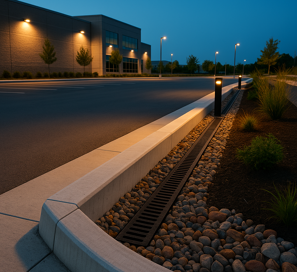
Vehicle Zones (Charcoal)
All areas designed for vehicle traffic—driving lanes, parking stalls, fire routes, loading docks—are executed in solid Charcoal. This accomplishes two things: (1) every form of vehicular wear (tire marks, fluid stains, exhaust deposits) is camouflaged, and (2) the dark, uniform field recedes visually, pushing the lighter pedestrian zones and building frontages forward in the viewer's perception. The parking lot becomes background. The storefronts become foreground. This is the same visual trick that high-end shopping centres use with dark flooring in common areas and bright lighting on retail frontages.
Pedestrian Zones (Off-White)
All areas designed for foot traffic—walkways connecting storefronts, building entrance aprons, outdoor seating terraces, accessible pathways—are executed in Warm Off-White. The immediate contrast against the Charcoal field makes pedestrian zones self-evident without requiring painted borders or separate signage. A customer exiting their vehicle in the Charcoal parking area sees the Off-White walkway and walks toward it naturally. This is instinctive colour navigation—deeply processed and effortless.
In Aurora, where emerging commercial developments along the Bayview Avenue, Yonge Street, and Leslie Street corridors increasingly combine retail, office, and residential uses in mixed-use formats, this pedestrian/vehicle colour differentiation is not merely aesthetic—it is a planning and safety requirement. Aurora's Site Plan Control process places significant emphasis on pedestrian safety within commercial developments, and a hardscape that visually communicates the boundary between vehicle domains and pedestrian domains supports compliance with the Town's urban design guidelines. We have seen Site Plan approval processes run more smoothly when the submitted hardscape plan demonstrates clear, colour-coded pedestrian safety zoning—it shows the planning committee that the developer has thought about the experience at the surface level, not just the structural one.
Transition and Safety Banding (Walnut)
Walnut banding is deployed at every transition point between vehicle and pedestrian zones:
- Pedestrian crossings within the parking area: alternating Walnut and Off-White bands, 300-400mm wide, creating a highly visible crosswalk that drivers recognise instinctively as a stop-and-yield zone
- Curb lines and step-down transitions: A 150-300mm Walnut band running along the edge of every raised pedestrian walkway, visible from both the vehicle-level pavement and the pedestrian-level walkway, signalling the grade change before it is felt
- Accessible route markers: AODA-compliant accessible routes and ramp locations marked with Walnut banding that provides both colour contrast (for low-vision navigation) and tactile contrast (if paired with a tactile indicator paver at ramp interfaces)
- Fire route delineation: The external edge of designated fire access routes is banded in Walnut, clearly communicating the no-parking boundary to visitors and delivery drivers without relying solely on painted curbs (which wear away and require annual repainting)
The Material Science: Colour That Lasts
A colour palette that looks perfect on installation day and fades to a washed-out version of itself by year five is not a palette—it is a liability. Commercial paver colour durability depends on three manufacturing factors:
Through-Mix vs. Surface-Applied Colour
Through-mix (integral colour): The iron oxide pigment is blended throughout the entire concrete body of the paver during manufacturing. The colour is the same at the surface as it is at the core. Surface wear, chipping, snowplough abrasion, and even pressure-washing cannot reveal a different-coloured substrate. This is the only acceptable colour method for commercial applications.
Surface-applied (face-mix or surface-coated): The pigment is concentrated in the top 5-8mm of the paver, with a grey concrete core beneath. This method produces vivid initial colour at lower manufacturing cost, but the colour layer wears through under heavy traffic, revealing the grey core in high-wear areas (parking stalls where tires pivot, walkway centres where foot traffic concentrates, and any area subjected to snowplough blade contact). Within 5-8 years on a commercial property, surface-applied colour pavers develop a characteristic "worn-through" appearance— colour at the edges, grey in the centres—that makes the property look neglected.
Cinintiriks specification: through-mix only, always. We do not install surface-applied colour pavers on any commercial project, regardless of budget. The cost difference is approximately $2-$4 per m²—negligible on a 5,000 m² installation ($10,000-$20,000 over the project) compared to the cost of full paver replacement when the surface colour wears through at year 7 ($150,000-$300,000+).
UV Stability
All paver colours experience some degree of UV-induced lightening over their service life. The rate and severity depend on the pigment type and concentration:
- Dark colours (Charcoal, Black): High iron oxide pigment concentration. UV lightening is most noticeable in absolute terms (the colour shifts from deep charcoal to a slightly lighter graphite over 8-15 years) but least objectionable visually because the shift stays within the same tonal family. The paver remains "dark" even as it lightens—it does not become a different colour
- Medium colours (Walnut, Tan, Grey): Moderate pigment concentration. UV lightening is moderate and gradual—the colour shifts toward a lighter, slightly warmer version of itself. Walnut becomes a lighter brown. Grey becomes a lighter grey. The shift is aesthetic but not alarming
- Light colours (Off-White, Cream, Ivory): Low pigment concentration with high cement content. UV lightening is minimal because the surface is already near the maximum lightness achievable by the concrete matrix. Off-White pavers at year 15 look nearly identical to Off-White pavers at year 1
The practical takeaway: the Charcoal-Off-White-Walnut palette ages in the same direction. All three colours lighten slightly and converge toward a warmer, softer version of themselves. The contrast ratios between the three colours remain stable because they shift in parallel. This is not true of palettes that mix warm and cool colours (a cool grey and a warm tan will age in different directions, with the cool grey becoming colder and the warm tan becoming warmer, producing an increasingly discordant visual relationship over time).
Efflorescence Management
Efflorescence—the white, chalky deposit that appears on new concrete pavers as calcium hydroxide migrates to the surface and reacts with carbon dioxide—is a temporary cosmetic condition, not a defect. It occurs on all concrete pavers regardless of manufacturer and is most visible on dark colours (where the white deposit contrasts sharply against the dark surface).
Efflorescence resolves naturally through weathering within 6-18 months of installation. It can be accelerated with a dilute acid wash (5-10% phosphoric acid solution) or with proprietary efflorescence cleaners. On commercial installations, where the Charcoal field may show significant efflorescence during the first winter, we include an efflorescence treatment in our post-installation care protocol—a cleaning pass in the first spring after installation that removes the surface deposits and restores the uniform Charcoal colour.
The Cinintiriks Approach: Colour Engineered for Commerce
At Cinintiriks, colour selection for multi-tenant commercial developments is not an afterthought decided at the showroom visit. It is a design-phase decision made in coordination with the site plan, the traffic study, the accessibility review, and the building architecture. Our Cinintiriks Standard for Commercial Colour Design integrates aesthetics with engineering:
1. Full-Site Colour Plan: Before a single paver is ordered, we produce a scaled, colour-coded site plan showing the exact placement of every colour zone: Charcoal vehicle areas, Off-White pedestrian zones, Walnut banding at transitions, crosswalks, and feature areas. This plan is submitted as part of the Site Plan approval package and serves as the installation reference document for the crew. There are no on-site colour decisions—every paver is placed according to the plan.
2. Through-Mix, CSA-Certified Pavers: We specify through-mix integral colour pavers from Canadian manufacturers meeting CSA A231.2 (minimum 50 MPa compressive strength, minimum 300 freeze-thaw cycles). Every paver on a Cinintiriks commercial installation carries full CSA certification. We do not install imported, uncertified, or surface-coated pavers on commercial projects—ever.
3. On-Site Colour Blending: Even within a single-colour zone, concrete pavers exhibit slight batch-to-batch colour variation (±5-10% tonal variance is normal in production). On a residential driveway, this variation is invisible. On a 5,000 m² commercial installation that may use 15-25 pallets of the same colour, batch variation can create visible "colour bands" where one pallet meets the next. We prevent this by pulling pavers from 3-4 pallets simultaneously and distributing them randomly across each section of the installation. The slight batch variation is scattered across the surface rather than concentrated in bands, producing a uniform visual field.
4. 80mm Minimum Thickness (Commercial Standard): All commercial pavers are specified at 80mm minimum thickness (100mm for heavy vehicle areas—fire routes, loading docks, refuse collection zones). The additional thickness provides structural capacity for commercial axle loads and, critically, provides more through-mix depth for the colour to remain consistent even under sustained surface abrasion from commercial traffic.
5. Sealed Colour Protection (Optional): For properties desiring maximum colour intensity and stain resistance, we apply a penetrating colour-enhancing sealer (not a film-forming topical sealer, which peels and yellows on commercial surfaces) that deepens the integral colour and provides a hydrophobic barrier against oil, beverage, and salt staining. The sealer is reapplied every 3-5 years as part of a maintenance program. It is not required for structural performance but significantly extends the "like-new" aesthetic window.
Don't let a poorly planned colour palette ruin your commercial property value. Contact Cinintiriks for elegantly designed, heavily engineered commercial paving solutions in Aurora and across the GTA.
FAQ: Commercial Paver Colour Selection
Do dark coloured pavers fade faster than light pavers in a commercial parking lot?
Dark pavers experience more noticeable UV lightening than light pavers, but they do not fade faster in absolute chemical terms. The iron oxide pigments in dark pavers (Charcoal, Black, Walnut) are the same mineral compounds used in light pavers, in higher concentrations. All iron oxide pigments are inherently UV-stable—they are inorganic minerals, not organic dyes, and they do not undergo photochemical degradation the way fabric dyes or paint pigments do. What happens is not fading but surface lightening: the cement matrix at the paver surface (which is light grey) becomes slightly more visible as microscopic surface wear exposes fresh cement between the pigment particles. On dark pavers, this produces a shift from deep charcoal to a slightly lighter graphite over 8-15 years. On light pavers, the same process is virtually invisible because the surface is already close to the cement's natural colour. The practical reality: a through-mix Charcoal paver on a commercial parking lot will still read as "dark" at year 20. It will be a slightly lighter, slightly warmer dark than it was at year 1, but it will never become grey, tan, or any other colour. The tonal shift is graceful, not dramatic, and it occurs uniformly across the entire installation—so the overall appearance remains cohesive.
How can I use paver colours to separate pedestrian zones from vehicle traffic?
This is one of the most effective and underutilised functions of colour in commercial hardscape design. The technique is called colour-coded wayfinding, and it uses high-contrast colour zones to communicate spatial function without signs or painted lines. The standard protocol: Charcoal for all vehicle areas (driving lanes, parking stalls, loading zones)—the dark field recedes visually and hides tire marks. Warm Off-White for all pedestrian areas (walkways, building entrance aprons, outdoor seating zones)—the light surface advances visually and is instinctively perceived as "safe" and "intended for people." Walnut banding at every transition point between the two zones (crosswalks, curb edges, ramp interfaces)—the contrasting band signals the boundary and the grade change. The Charcoal-to-Walnut-to-Off-White sequence creates a visual gradient that the eye reads as a progressive transition from vehicle domain to pedestrian domain. Visitors navigate it instinctively, without reading signs. This is particularly effective in multi-tenant retail plazas where visitors may be unfamiliar with the property layout—the colour itself guides them from their vehicle to the storefronts. From a compliance perspective, colour-coded wayfinding also supports AODA accessibility requirements by providing visual contrast at grade changes and route boundaries for persons with low vision.
Are lighter pavers harder to keep clean in a high-traffic retail plaza?
Somewhat, but not as much as most people assume. The concern is that Warm Off-White pedestrian pavers will show dirt, staining, and foot-traffic soiling more than Charcoal pavers. This is true in absolute terms—a dark mark on a light surface is more visible than the same mark on a dark surface. However, the Off-White zones in our recommended palette are pedestrian-only areas, which means they are not exposed to the worst soiling sources (tire rubber, motor oil, exhaust deposits)—those are confined to the Charcoal vehicle zones. The soiling that pedestrian zones experience (foot-traffic dust, leaf stains, beverage spills, chewing gum) is manageable with a standard commercial maintenance program: power washing 1-2 times per year ($0.50-$1.50/m²), spot-treating gum and stains as needed, and applying a penetrating sealer every 3-5 years to provide a hydrophobic barrier that prevents stains from penetrating the paver pores. On properties where we have installed the Charcoal/Off-White/Walnut palette, the Off-White walkways require one additional power wash per year compared to the Charcoal zones—a cost of approximately $500-$1,500 annually for a typical multi-tenant development. This is a trivial maintenance cost relative to the wayfinding value, the pedestrian safety value, and the aesthetic lift that the colour contrast provides.
The Final Word
Paver colour selection for a multi-tenant commercial development is not a decorating decision. It is a strategic design decision that affects tenant attraction, property value, maintenance costs, pedestrian safety, accessibility compliance, and the long-term visual integrity of the property.
The palette that performs across all of these dimensions is remarkably simple: Deep Charcoal, Warm Off-White, Rich Walnut. Three colours. Through-mix integral colour. CSA-certified, 80mm minimum thickness. Placed according to a colour-coded site plan that assigns each colour to a functional zone—vehicle, pedestrian, transition.
The result is a hardscape that looks as sophisticated at year 15 as it does at year 1. A surface that hides wear where wear happens and shines where tenants and customers gather. A canvas that makes every brand on the property look better without favouring any one of them.
That is commercial colour design. Not decoration. Not trend-chasing. Architecture.