This is the most common and most expensive aesthetic mistake in residential outdoor living design: selecting each element in isolation. The homeowner chooses pavers they like from one manufacturer’s showroom display, natural stone they like from a different supplier, a wood stain colour they saw on Pinterest, and a retaining wall block that was on sale. Each element individually looks attractive. Together, they produce a visual cacophony—warm tones fighting cool tones, busy patterns competing with other busy patterns, three or four different stone species creating a geological argument in what should be a serene, unified space.
Luxury is not about the price of the materials. Luxury is about intention. It is about every surface, every structure, and every planting bed communicating the same aesthetic message. It is the absence of visual noise. It is the discipline to say no to a beautiful material because it does not belong in this palette, on this property, with this architecture.
This guide is the colour discipline. It is the specific, proven palette and the precise application ratios that produce a cohesive, resort-calibre outdoor living area every time—regardless of the home’s architectural style, the lot size, or the scope of the project.
The Aesthetic Blueprint: Why Cohesion Requires Discipline
Walk through any five-star resort. The pool deck, the dining terrace, the pathways, the lounge areas, the landscape lighting—every element exists within an intentionally restricted colour palette. Typically no more than three tones. The palette is not restricted because the resort could not afford more colours. It is restricted because restriction is what creates the feeling of luxury.
This is not subjective. It is architectural psychology, grounded in decades of research into how the human visual system processes space. When the eye encounters a surface composed of a limited, harmonious palette, the brain processes the environment as calm, ordered, and expensive. When the eye encounters a surface with four, five, or six competing colours and textures, the brain processes it as busy, chaotic, and cheap—even if the individual materials cost $80 per square metre. The irony of high-end outdoor design is that adding another material, another colour, or another pattern almost always reduces the perceived value of the space rather than increasing it.
In Whitby, where the residential architectural landscape ranges from classic red-brick colonials in the established Brooklin and Downtown neighbourhoods to contemporary builder homes in newer developments along Taunton Road and the Whitby Shores waterfront, the outdoor colour palette must be versatile enough to complement dramatically different home exteriors while maintaining its own internal coherence. The palette we are about to describe does exactly that—it works with warm red brick, it works with cool grey stone veneer, it works with painted white siding, and it works with dark modern cladding. That versatility is not an accident. It is by design.
The Luxury Minimalist Palette: The Signature Triad
After designing and installing hundreds of luxury outdoor living spaces across the GTA, we have arrived at a three-colour architectural palette that produces a cohesive, modern, timeless aesthetic on every property type we have ever applied it to. It is not complicated. It is not trendy. And it is extraordinarily effective.
1. Warm Off-White (The Dominant Surface)
Warm Off-White—not cold, bluish white, not grey, not beige, but specifically the warm ivory-to-cream spectrum—is the primary paver colour for the main entertaining surface. This is the patio, the walkway, the pool surround, the dining terrace. It is the single largest colour field in the outdoor living area, and it sets the foundational tone for everything around it.
Why Warm Off-White dominates the luxury palette:
- Thermal performance: Light-coloured pavers reflect significantly more solar radiation than dark pavers. On a July afternoon in Whitby, a Charcoal paver surface can reach 60-70°C—uncomfortably hot barefoot. A Warm Off-White paver surface in the same conditions typically stays at 35-45°C—warm, but comfortably walkable. For families who use their patio as an extension of their living space (barefoot children, bare feet from the pool, casual entertaining), thermal comfort is not a secondary consideration. It determines whether the patio is actually used on the hottest days of summer or becomes an untouchable solar oven
- Spatial perception: Light surfaces make enclosed spaces feel larger, more open, and more inviting. In a typical Whitby backyard—which is often 30 to 50 feet deep from the house to the rear property line—a dark paver field can make the space feel compressed and heavy. A Warm Off-White field opens the space visually, reflects ambient light (especially important during dusk and twilight entertaining), and creates the sensation of a resort terrace rather than a suburban patio
- Architectural neutrality: Warm Off-White does not compete with the home’s exterior. It recedes. Whether the house is red brick (common in Whitby’s established neighbourhoods), grey stone veneer (prevalent in newer builds), or white-painted siding, the Warm Off-White patio surface complements without fighting. It is a canvas, not a statement
- Landscape integration: Warm Off-White provides the highest contrast against green foliage, making planting beds and lawn edges appear more vivid and lush. The patio surface becomes the frame, and the softscaping becomes the painting. This is the same principle that galleries use when they mount artwork on white walls—the neutral background amplifies the subject
Manufacturer specification: Look for “Ivory,” “Champagne,” “Sandstone,” or “Cream” in the through-mix integral colour range from major Canadian manufacturers (Unilock, Oaks, Permacon, Techo-Bloc). Avoid pure white—it shows dirt aggressively, produces harsh glare in direct sun, and reads as clinical rather than warm. The warm undertone is what distinguishes an inviting luxury surface from a sterile one.
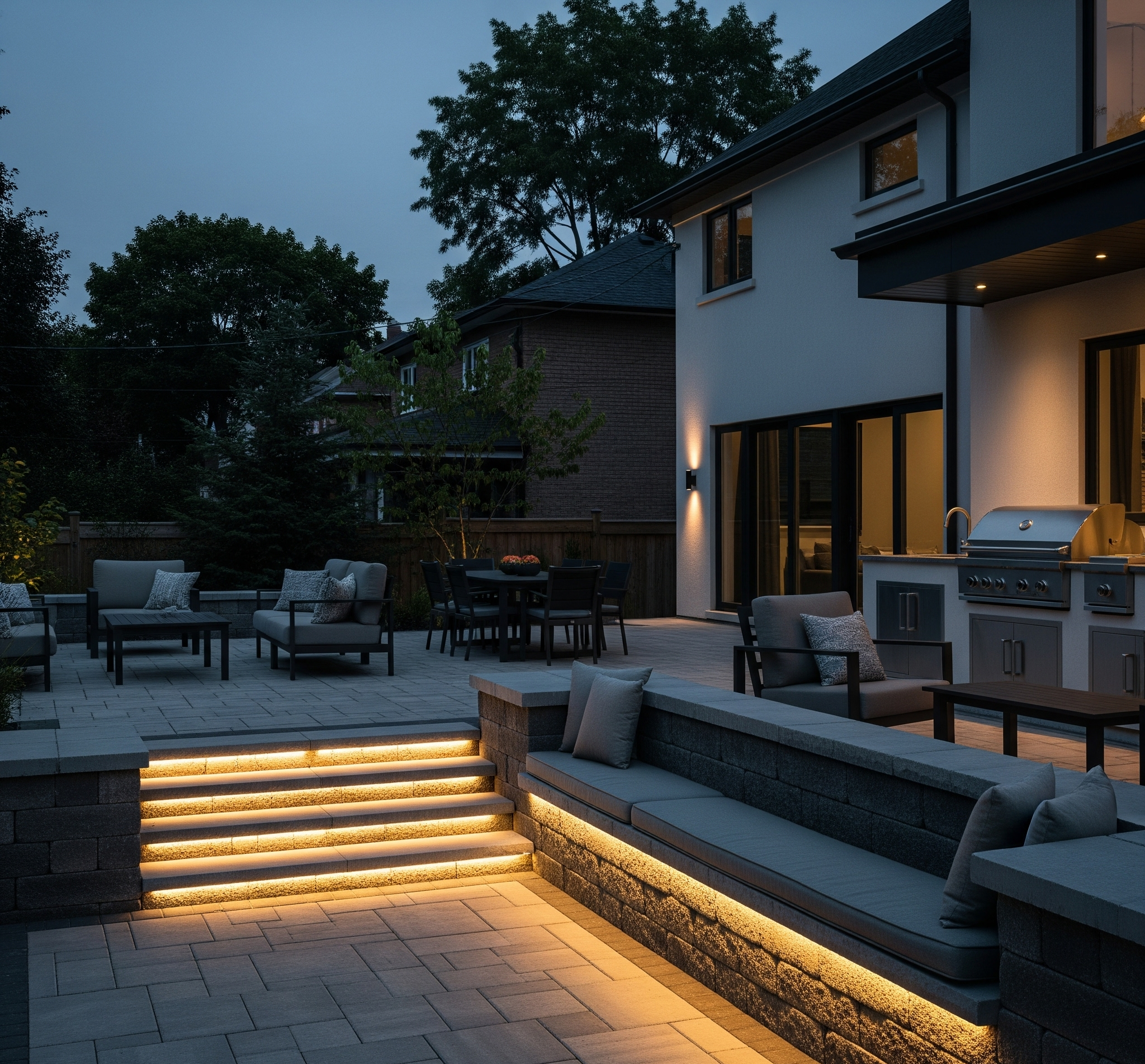
2. Deep Charcoal (The Structural Anchor)
Deep Charcoal is the grounding element—the visual weight that prevents the Warm Off-White field from feeling bland, flat, or unfinished. It is used for structural and border elements that define edges, create hierarchy, and communicate architectural intention:
- Paver borders: A 300-600mm Charcoal soldier course running along the perimeter of the Off-White patio field creates a crisp, architectural frame that defines the space with precision. Without the border, the patio surface bleeds into the surrounding landscape without definition. With it, the patio is a composed space—clearly delineated, intentionally shaped
- Retaining wall caps and faces: Structural retaining walls, seating walls, and planter walls in Charcoal provide a dramatic tonal contrast against the Off-White patio surface. The dark horizontal lines of wall caps read as modern, contemporary, and deliberate—a design language that signals high-end construction regardless of whether the home itself is traditional or modern
- Outdoor kitchen shell: A Charcoal stone veneer or paver-clad outdoor kitchen island set against the Off-White patio field creates a focal anchor—a visually heavy element that draws the eye and establishes the kitchen as the centrepiece of the entertaining zone. The Charcoal surface also hides cooking stains, grease splatter, and general kitchen-area wear far more effectively than a light-coloured island
- Step treads and risers: Charcoal step treads with Off-White risers (or vice versa) create a high-contrast safety feature that makes grade changes visible from a distance. This is not merely aesthetic—it is a functional design choice that reduces trip risk and supports AODA-compliant accessibility design
The psychology of Charcoal in outdoor design is weight and authority. A space composed entirely of light tones feels ephemeral—pleasant, but not architecturally serious. Charcoal introduces gravity. It tells the eye that this space is built, structured, and permanent. The combination of light-field and dark-structure is the visual language of every high-end resort, boutique hotel, and luxury residential development built in the last twenty years. It is the palette of contemporary luxury because it is the palette that the human eye reads as timeless sophistication.
3. Rich Walnut (The Organic Warmth)
A space composed only of Off-White and Charcoal is sophisticated but potentially cold—all stone, all mineral, all hard edges. Rich Walnut is the element that introduces organic warmth, texture, and life into the palette. It is the colour of natural wood, of cedar and ipe, of the warmth of a campfire and the richness of espresso. And it is used sparingly, in elements that naturally express wood or organic materials:
- Pergola and pavilion structures: A cedar, ipe, or composite pergola stained or finished in a Rich Walnut tone introduces an overhead plane of warm colour that softens the mineral hardscape below. The Walnut structure against a backdrop of green mature trees creates a layered, three-dimensional colour composition that feels curated and intentional
- Privacy screens and fencing: Horizontal-slat cedar privacy screens in Walnut tones provide a warm, modern backdrop to the entertaining area. The Walnut wall visually encloses the space without the heaviness of a stone wall, creating an intimate, room-like atmosphere
- Furniture and accessories: Outdoor dining tables, lounge seating frames, and decorative planter boxes in Walnut tones echo the overhead structures and privacy screens, creating a cohesive thread of warmth that ties the upper and lower planes of the outdoor room together
- Accent banding: A narrow Walnut-toned paver band (150-300mm) placed between the Off-White field and the Charcoal border creates a transitional detail that softens the contrast between the two primary tones. This banding is the equivalent of a picture frame moulding—a small detail that elevates the entire composition from “nice” to “designed”
“Off-White gives you calm. Charcoal gives you structure. Walnut gives you soul. Three tones. One language. That is the entire palette.”
The 60-30-10 Rule in Hardscaping
Interior designers have used the 60-30-10 ratio for decades to create balanced, harmonious rooms. The principle translates directly to outdoor living design, and it is the precise formula that prevents the three-colour palette from becoming either monotonous (too much of one tone) or chaotic (too much variety).
60% — Warm Off-White (The Dominant)
The Warm Off-White paver field covers approximately 60% of the total hardscape surface area. This is the main patio, the primary walkways, the pool surround (if applicable), and any secondary entertaining zones. The psychological effect of a 60% dominant field is calm and spaciousness. The eye has a large, consistent plane to rest on, and the brain interprets this consistency as order.
In Whitby, where many residential lots in developments like Whitby Shores, Jeffery, and Country Lane have rear yards of 1,200 to 2,500 square feet, the Off-White dominant field is especially effective because it makes these mid-size to generous lots feel larger than they are. Light surfaces reflect more ambient light during the golden hour and twilight periods, extending the perceived usability of the space into the evening—a meaningful advantage in Ontario, where the summer entertaining season is compressed and every hour of outdoor use is valuable.
30% — Deep Charcoal (The Secondary)
The Charcoal elements—borders, retaining walls, outdoor kitchen cladding, step treads, and structural accents—cover approximately 30% of the total hardscape surface area. This is enough dark tone to provide strong architectural definition without overwhelming the space. The 30% Charcoal proportion creates the visual “skeleton” of the design—the edges, frames, and structural anchors that give the space shape and form.
Getting this ratio right is critical. If Charcoal drops below 20%, the borders and structural elements become too subtle—the space loses its architectural definition and reads as a flat, undifferentiated light surface. If Charcoal exceeds 40%, the space becomes heavy, compressed, and visually aggressive. The 30% target is the balance point where Charcoal asserts itself architecturally without dominating the composition.
10% — Rich Walnut and Living Green (The Accent)
The Walnut woodwork, accent banding, and—critically—the lush green softscaping collectively comprise the final 10% accent layer. This is the layer of richness, texture, and sensory depth that transforms a hardscape composition into a living outdoor room.
The inclusion of living plant material in the 10% accent category is deliberate. A luxury outdoor space is not a quarry. It needs life. Strategically placed specimen trees (Japanese Maples, Serviceberries, ornamental Redbuds), boxwood border hedges, ornamental grasses, and perennial planting beds provide the organic contrast that prevents the stone and concrete palette from feeling sterile. The green of living plants against the Warm Off-White paver surface is one of the most visually powerful contrasts in outdoor design—it is the visual equivalent of a perfectly plated dish on a white plate. The white surface elevates the green.
Blending the Palette with Your Home’s Exterior
The outdoor palette does not exist in isolation. It must integrate visually with the back of your house, which is—let us be honest—the most prominent visual element in your backyard. The patio might be beautiful, but if the paver colour clashes with the house brick, the entire composition fails.
Here is how the Off-White / Charcoal / Walnut triad integrates with the most common home exterior types in Whitby and the broader Durham Region:
Red or Brown Brick (Traditional / Colonial)
Red and brown brick are the most common exterior finish in Whitby’s established neighbourhoods. The warm undertone of the Off-White paver surface harmonises naturally with the warm undertone in red and brown brick. They share the same warm spectrum. The Charcoal borders provide a modern counterpoint to the traditional brick, updating the aesthetic without clashing. The Walnut woodwork echoes the warm midtones in the brick, creating a tonal bridge between the house and the patio.
Critical rule: Do not attempt to match the paver colour to the brick colour. Matching creates a monolithic wall of colour that looks like the patio is trying to mimic the house. Instead, complement the brick by choosing a paver in the same warm family but a distinctly different tone. If the brick is warm red, the Off-White paver is warm cream—same warmth, different tone. The relationship is harmonious, not identical.
Grey Stone Veneer (Contemporary / Builder)
Grey stone or manufactured stone veneer is increasingly common on newer Whitby homes, particularly in developments along Taunton Road and in the Brooklin expansion areas. Grey stone is inherently cool-toned. The Warm Off-White paver surface introduces warmth that the grey house lacks, preventing the overall composition from feeling cold and institutional. The Charcoal borders echo the dark mortar lines in the stone veneer, creating a visual connection between house and patio. The Walnut woodwork provides the organic warmth that counterbalances the cool mineral tones of both the grey stone and the Charcoal accents.
White or Light-Coloured Siding
White or light-painted siding is common on heritage homes and some contemporary builds. Here the palette integration is effortless: the Off-White paver surface is a slightly warmer version of the siding tone, creating a seamless light-to-light transition from house to patio. The Charcoal elements become the primary visual contrast, which makes the architectural details (borders, walls, kitchen island) read as bold, graphic, and intentional against the light field. The Walnut woodwork adds warmth and depth to what could otherwise become an overly stark white-and-black composition.
Dark Modern Cladding (Board-and-Batten, Dark Brick)
Darker exteriors are trending in newer Whitby developments. Dark charcoal board-and-batten, dark grey brick, or black metal cladding create a moody, contemporary aesthetic. Here, the Off-White patio surface creates a dramatic tonal contrast that visually separates the outdoor living area from the house mass. The patio glows against the dark house—an effect that is particularly stunning at dusk with landscape lighting. The Charcoal borders and walls echo the dark house tones, tying the patio back to the architecture. The Walnut accents soften the high-contrast composition with organic warmth.
“We have applied this palette to red brick Colonials in Downtown Whitby and modern dark-clad builds on the Whitby waterfront. The same three colours. Completely different homes. Equally cohesive results. That is the power of a palette designed around neutrality rather than trend.”
What to Avoid: The Colour Mistakes That Destroy Cohesion
Knowing what works is important. Knowing what to avoid is equally important—because these mistakes are the ones we see most frequently on properties across the GTA, and they are extremely difficult to correct after installation.
Multi-colour paver blends. The “autumn blend” or “heritage mix” pavers with three or four intermixed colours were popular in the early 2000s. On a luxury outdoor living space, they are a design disaster. The random colour variation eliminates the possibility of clean colour zoning (because the field itself is already multi-coloured), fights with planting bed colours, and dates the property immediately. Multi-colour blends signal 2005 subdivision patio. A solid Off-White field signals 2026 luxury terrace.
Trendy, saturated colours. Terracotta, salmon, cobalt blue, forest green pavers cycle through design trends every 8-12 years. They look fresh in year one, acceptable in year five, and embarrassingly dated by year ten. An outdoor living space is a 20-to-30-year investment. The palette must survive at least two full trend cycles without looking like a time capsule. Off-White, Charcoal, and Walnut are not trends. They are architectural constants. They were elegant in 2006 and they will be elegant in 2036.
Too many materials. Mixing interlocking pavers with natural flagstone with poured concrete with exposed aggregate in a single backyard is a recipe for visual chaos. Limit the primary surface material to one type (interlocking pavers or poured concrete, not both). Accent materials (natural stone step treads, stone veneer on kitchen walls) should be used sparingly and within the same tonal palette. Every additional material species adds visual complexity. At some point, complexity crosses into clutter.
Ignoring the house. The backyard does not exist in a vacuum. The rear elevation of the house is the largest vertical surface visible from the patio. If the paver palette does not acknowledge the house colour, the result is a patio that looks like it belongs on a different property. The palette discussion must always start with the house, not the showroom.
The Cinintiriks Approach: Designed, Not Decorated
At Cinintiriks, we do not let our clients guess at colour boards. We do not hand you a stack of paver samples and say “pick what you like.” Colour selection on a Cinintiriks project is a design-phase discipline guided by the same architectural principles described in this guide.
The Cinintiriks Standard: Cinematic Outdoor Colour Design
1. House-First Colour Analysis: Every Cinintiriks project begins with a detailed colour analysis of the home’s rear elevation. We photograph the brick, stone, siding, trim, window frames, and existing hardscape in natural light. We identify the dominant tone, the undertone (warm or cool), and any accent colours that the outdoor palette must harmonise with. The palette is designed for the specific house, not from a generic lookbook.
2. On-Site Sample Presentation: We bring full-size paver samples (not 4x4 chips) to your Whitby property and lay them against the house wall, in the proposed patio location, in natural sunlight. Showroom lighting and natural outdoor light produce dramatically different colour perceptions. A paver that looks warm ivory under showroom fluorescents may read as cold grey in outdoor shade. We evaluate every colour on-site, under the actual lighting conditions it will live in, before any commitment is made.
3. Through-Mix Integral Colour Specification: We specify through-mix pavers exclusively. The iron oxide pigment is blended throughout the entire paver body during manufacturing. The colour is identical at the surface and at the core. Surface wear, snowplough abrasion, chipping, and even pressure washing cannot reveal a different-coloured substrate. Surface-applied or face-mix pavers (where colour is concentrated in the top 5-8mm) wear through under heavy use, exposing the grey concrete core and destroying the colour integrity of the surface. We do not install surface-applied colour pavers on any project.
4. The 60-30-10 Layout Plan: Before any paver is laid, we produce a scaled, colour-coded layout plan showing the exact placement of every colour zone: the Off-White field, the Charcoal borders and structural elements, the Walnut accent banding and feature zones. This plan is the installation reference. There are no on-site colour decisions. Every paver is placed according to the approved plan.
5. Batch Blending for Colour Uniformity: On projects requiring multiple pallets of a single colour, we pull pavers from three to four pallets simultaneously and distribute them randomly across each section of the installation. This eliminates visible “colour banding” where one production batch meets the next. The slight natural batch variation (±5-10% tonal variance is normal) is scattered uniformly across the surface rather than concentrated in visible stripes.
6. Lighting-Integrated Colour Planning: The colour palette is designed in coordination with the landscape lighting plan. Warm-white LED fixtures (2700K colour temperature) are specified to complement the warm undertone of the Off-White pavers and the Walnut woodwork. Cool-white LEDs (4000K+) would make the warm palette look grey and lifeless at night. The lighting colour temperature is as important as the paver colour in achieving a cohesive after-dark aesthetic.
Don’t ruin your backyard investment with clashing colours. Contact Cinintiriks for a seamlessly designed, luxury minimalist outdoor living space in Whitby.
FAQ: Outdoor Living Colour Design
Do dark charcoal pavers get too hot to walk on barefoot in the summer?
Yes, they absolutely can. Dark-coloured pavers absorb significantly more solar radiation than light-coloured pavers. On a sunny July afternoon in southern Ontario, a dark Charcoal paver surface can reach 60-70°C (140-158°F)—hot enough to cause discomfort and, at the extreme, mild contact burns on bare skin. A Warm Off-White paver in the same conditions typically stays at 35-45°C (95-113°F)—warm, but comfortably walkable. This is precisely why we recommend Warm Off-White as the dominant field colour (60% coverage) and limit Charcoal to borders, structural accents, and non-walking surfaces (retaining wall faces, kitchen islands, step risers). The areas you walk on barefoot are light. The areas that provide architectural definition are dark. This is not just aesthetic logic—it is thermal engineering. The 60-30-10 ratio is, among other things, a comfort system. On pool surround areas where barefoot traffic is guaranteed, we sometimes reduce the Charcoal proportion to a narrow perimeter border only, maximising the cool Off-White walking surface while maintaining architectural definition at the edges.
Should my patio pavers perfectly match the brick on the back of my house?
No. In fact, attempting to match is one of the most common and most damaging colour mistakes in outdoor design. When a paver is chosen to match the house brick, the result is almost never a true match—the paver is manufactured concrete with iron oxide pigment, and the brick is fired clay with natural mineral colour. They are different materials that reflect light differently, and even if they look similar on the showroom shelf, they will look noticeably different when installed side-by-side in natural sunlight at different viewing angles. The near-match—close but not identical—is the worst possible outcome because it reads as an attempt that failed. The eye perceives the slight mismatch as a mistake rather than a design choice. The correct approach is complementary contrast: choose a paver colour in the same warm or cool family as the brick, but a distinctly different tone. If the brick is warm red, pair it with a Warm Off-White (cream/ivory) paver—same warm spectrum, different tone. The contrast is intentional, readable, and universally attractive. The patio relates to the house without pretending to be the same material. This complementary relationship is what architects call “dialogue”—two materials in conversation, not imitation.
How do I keep warm off-white pavers from looking dirty over time?
This is the most common objection to light-coloured paver surfaces, and the concern is understandable but significantly overstated. Light pavers show certain types of soiling more visibly than dark pavers (leaf stains, tire marks on driveways, and organic discolouration from overhanging trees). However, the maintenance required to keep Off-White pavers looking clean is modest and routine: (1) Annual power washing ($0.50-$1.50 per square metre) removes accumulated surface grime and restores the original colour. On most residential patios, this is a single afternoon of work or a $300-$600 professional service call. (2) Penetrating paver sealer applied every 3-5 years provides a hydrophobic barrier that prevents stains from penetrating the paver pores. Spills, leaves, and organic materials sit on the sealed surface and are removed by rain or routine sweeping rather than absorbing into the concrete matrix. (3) Prompt treatment of organic stains (fallen berries, leaf tannins, mulch runoff) with a dilute oxygen bleach solution prevents permanent discolouration. The key is addressing organic stains within 24-48 hours rather than allowing them to set. In practice, our clients who follow this basic maintenance protocol report that their Off-White pavers look essentially unchanged at year five compared to year one. The perception that light pavers are “high maintenance” is a holdover from the era of surface-applied colour pavers that did stain permanently. Modern through-mix pavers with a penetrating sealer are remarkably stain-resistant, and the aesthetic return—the calm, spacious, resort-calibre feel of a light patio surface—far outweighs the incremental maintenance effort.
The Final Word
The colour scheme of your outdoor living area is not a decorating decision. It is an architectural decision that will define the aesthetic character of your property for the next 20 to 30 years. Get it right, and every element—pavers, walls, woodwork, plantings, lighting—speaks the same visual language. Get it wrong, and no amount of premium material can compensate for the fundamental discord.
The palette that produces cohesion is remarkably simple: Warm Off-White, Deep Charcoal, Rich Walnut. Three tones. One language. Applied at the 60-30-10 ratio that interior designers have used for decades and that translates perfectly to outdoor hardscape design. Complemented by the lush green of strategic softscaping. Specified in through-mix integral colour from established Canadian manufacturers. And designed—always—in response to the specific colour, tone, and character of the house it sits beside.
That is not decoration. That is architecture. And that is The Cinintiriks Standard.